BRANDING
Eduardo is funny — and his business reflects that...
When Du Pastelaria reached out to us, the goal was clear: to create a brand where the pastel would be more than just a snack, but a truly memorable experience. The challenge was translating Eduardo’s essence — well known in his region for his joy and charisma — into a visual identity that communicated flavor, tradition, and a touch of his good humor.
Branding Case – ViaMundo Marketing
Concept
The name “Du Pastelaria” already carried a relaxed and friendly tone, opening space for a fun, approachable brand full of personality. The visual identity needed to reflect that: a warm, inviting look, full of energy — communicating both product quality and the brand’s lighthearted, cheerful atmosphere.
Visual identity and typography
The visual identity was built around three essential elements:
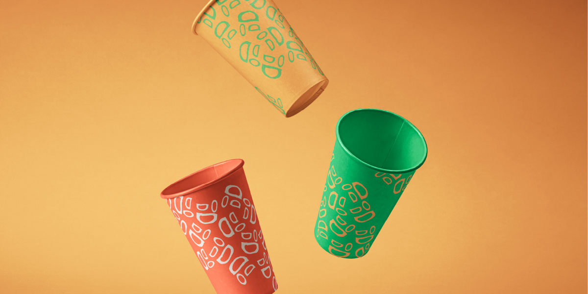
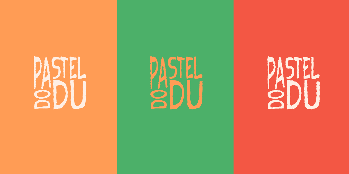
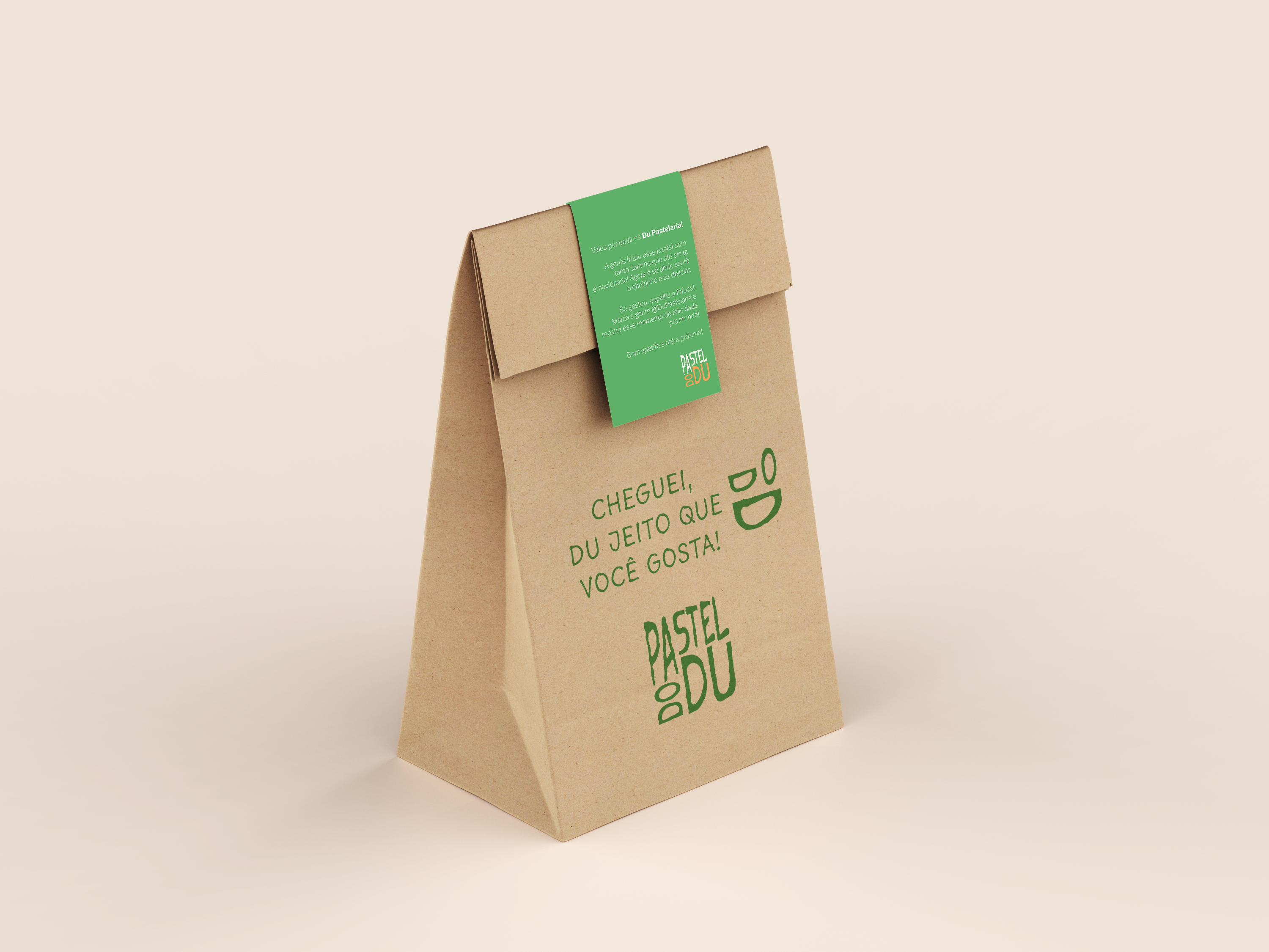
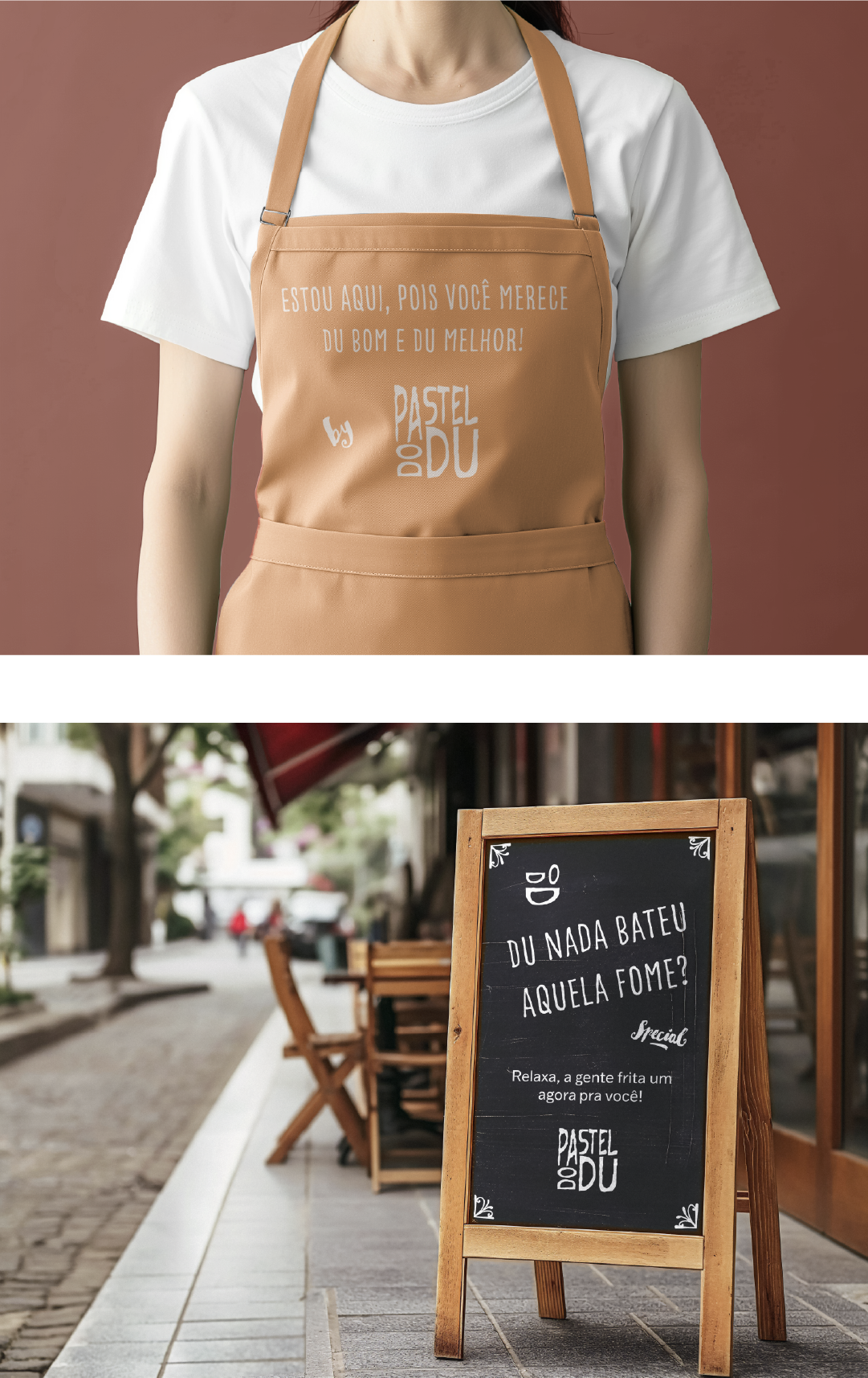
Green, red, and orange were strategically chosen to represent the brand’s essence. Green, inspired by fresh sugarcane juice, reinforces the idea of tradition and balance in the perfect combo. Red stimulates appetite and symbolizes passion for pastel, while orange conveys warmth and friendliness, reinforcing the idea of a product that’s always hot and crispy. The chosen typography features friendly shapes, reflecting an accessible and welcoming tone. The logo incorporates visual elements that playfully reference a pun with the brand’s name! :D
What about a few wordplays?
The name Du Pastelaria naturally opens the door to playful expressions that connect the brand with its audience in a spontaneous way.
Du heaven for your taste buds
Highlighting the irresistible flavor of the pastels.
Out of the blue… feeling hungry?
Creating a natural and inviting hook to attract customers.
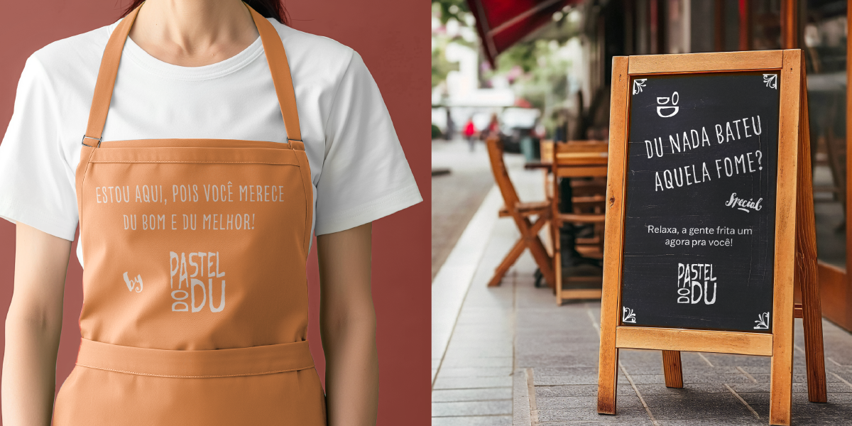
You deserve Du good and Du best!
Reinforcing quality and care in every detail.
Du way you like it
Emphasizing the care and love put into every product.
Visual Identity Case – ViaMundo Marketing
Approachable, with great humor
The tone of voice for Du Pastelaria follows three core principles:
Lightness and spontaneity: Communication is natural, like a conversation between friends. No unnecessary formality — just straight talk, simple and easy.
Good humor and friendliness: The brand aims to bring smiles even before the first bite. Fun, relaxed messages make the experience even more enjoyable.
Warmth and closeness: Customers are not just customers — they are part of the story. Expressions like “Come on in, we’ve got pastel just the way you like it!” create a welcoming and inviting atmosphere.
Foodservice Cup – ViaMundo Marketing